Would You Prefer a Dark Mode or a Light Mode User Interface in the Year 2025?
Dark Mode vs. Light Mode: The Controversy in 2025 User interface design is a hot topic right now. Choosing the correct user interface (UI) theme is crucial for UX, accessibility, and brand perception in this age of digital experiences dominating our work, shopping, communication, and learning.
Therefore, in the year 2025, which user interface will be superior? Performance, design trends, customer preferences, and industrial applications are the main aspects to consider while breaking it down.
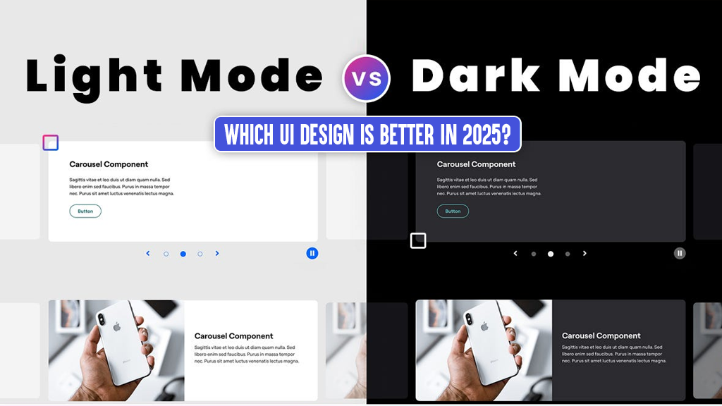
Comparing Dark and Light Modes: What Are They?
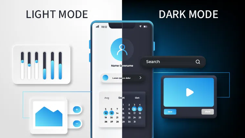
In Dark Mode, the user interface is black with light-colored text, icons, and other design components. It is commonly linked to contemporary, minimalist, and aesthetically pleasing user interfaces.
In contrast, Light Mode UI mimics the readability and familiarity of traditional printed media by using dark text on a white or light background.
A Dark Mode Revolt in the Year 2025
Dark Mode is here to stay. It has become an essential part of user interface and experience design after being adopted by big platforms such as Instagram, YouTube, Google, and Apple.
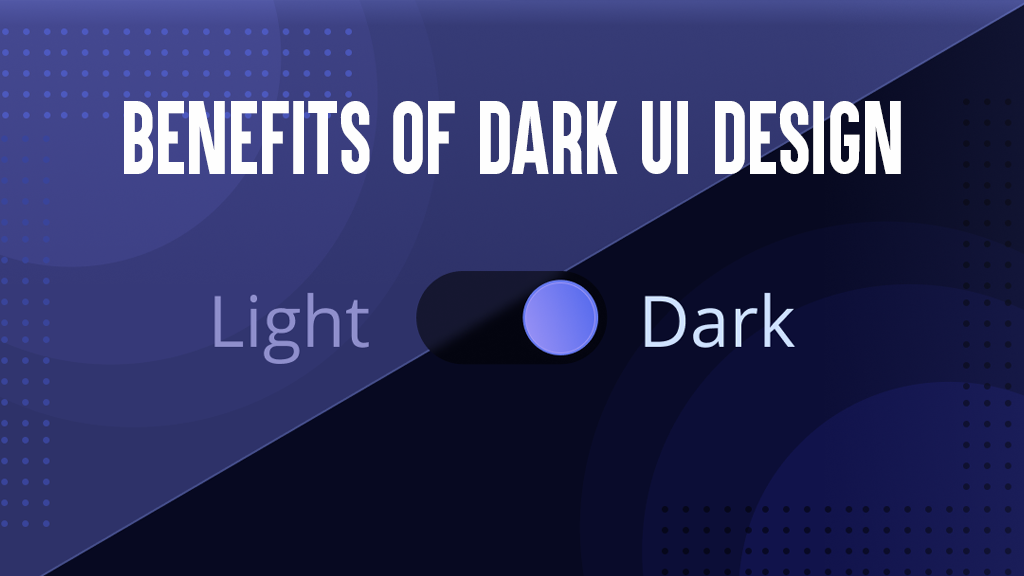
Advantages of a Dark User Interface:
Ease of Vision: Particularly in Dim Light.
Power Savings: Using Dark Mode on OLED and AMOLED screens reduces power consumption.
Modern Aesthetic: Experiences with dark themes tend to be more futuristic, high-end, or technologically advanced.
Improved Focus: Images and videos seem better against dark backgrounds.
Utilising Dark UI When Appropriate:
Media and entertainment
Software for developers or dashboards
Apps for late-night web surfing
Marketing that targets high-end or technological consumers
The Persistent Dominance of Light Mode
In 2025, many websites and apps still use Light Mode as their default, even if dark themes are all the rage.
Light User Interface Advantages:
Reading & Clarity: Most people find that dark writing on a white background is simpler to scan.
Intuitive for first-time users because it mimics paper.
Reliable Daytime Visibility: Works best in well-lit environments.
When is Light UI Appropriate?
News sites, blogs, and websites with a lot of content
Platforms for online sales
Applications for health and education
Any website that aims to reach a wide audience
The Preferences of Users in the Year 2025: The Evidence
Find out more about the latest surveys and user behaviour here:
For nighttime or low-light use, 70% of users favour Dark Mode.
During the day or when reading is involved, 60% of users still favour Light Mode.
Dark mode and other user interface theme customisation options are more popular among users younger than 35.
Contrast and personalisation choices, according to accessibility specialists, are more crucial than a static theme.
Issues with Accessibility and User Experience
Contrast ratio and legible font are essential in both dark and light design. User annoyance and high bounce rates can result from a poorly executed implementation of either mode.
Optimal Procedures:
Keep text contrast ratios consistent with WCAG 2.1.
Opt for off-blacks and soft whites instead of pure blacks or whites.
Give them the option to choose between different themes.
Perform cross-device and cross-light UI testing.
Personality and Branding
Which theme works best for your brand depends heavily on its personality:
For a more contemporary look and feel, Dark Mode is a popular choice among IT firms and SaaS products.
For the sake of simplicity and trust-building, retail businesses and service platforms prefer Light Mode.
The genre or personal preference of the user dictates how often gaming and entertainment apps change.
Should We Expect Adaptive and Hybrid User Interfaces in the Future?
Adaptive user interface ideas are trending in 2025. Systems like these change themes depending on:
Preferences of the user’s system
Observational period
Ambient light level (as measured by the device’s sensors)
It seems like the greatest user interface designs of the future will be those that can change with the times, rather than static ones.
Who Has the Better User Interface in the End?
No single solution will work in every situation. In the year 2025, the deciding factors between Dark and Light UI are:
Who you want to reach
Personality traits associated with your brand
The category of material you’re using
Your ability to implement technical solutions
Standard operating procedure? Give them both. Allow consumers to make their own selection. An auto-detect system or toggle switch enhances UX and increases engagement.
Want professional assistance creating a user interface that will be memorable in the year 2025? If you are looking for brand-specific, adaptive, modern, and user-first interface solutions, our UI/UX design team is the place to go!